Two months ago I wrote Tools in My Designer Tool Belt: A/B Testing based on my presentation at SXSW 2016. I got as far as talking about the process of pulling that presentation together including the first two times I heard about A/B testing. Here I'll go through the basics of A/B testing as a UX designer.
•••••
So what is A/B testing? In modern product development, it is the practice of deploying two or more versions of a digital product or service that differ in non-arbitrary ways in order to compare how they perform. It is essentially the scientific method applied to product design & development.
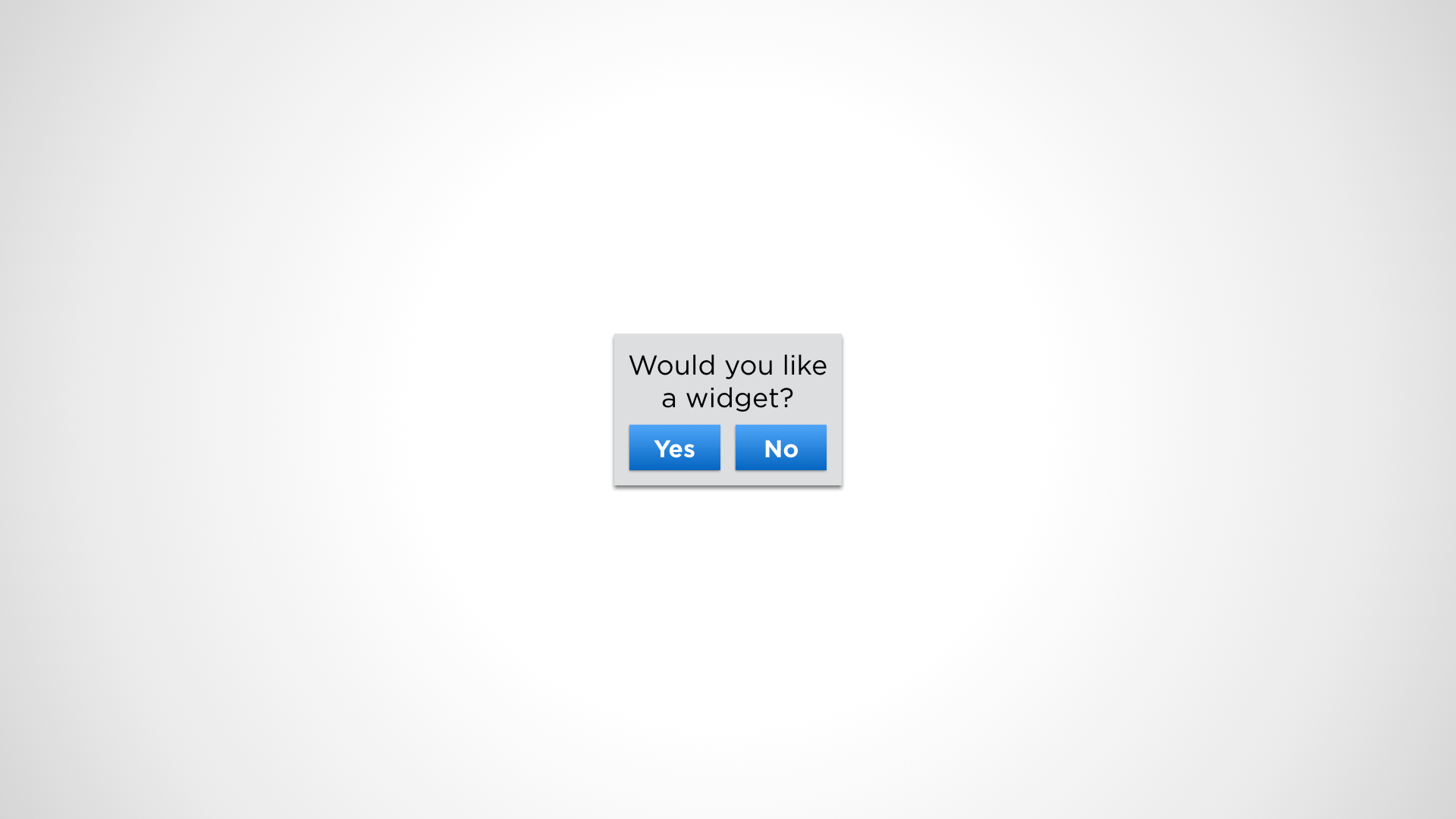
Let's say you are selling widgets using a very simple design in your online store, like this.
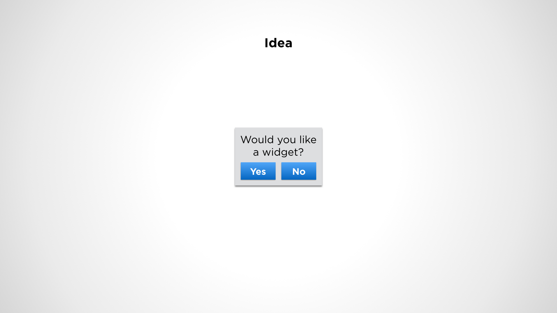
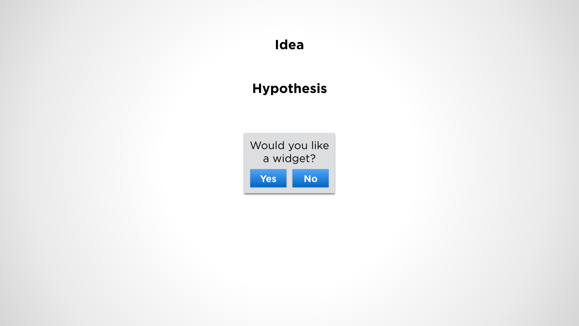
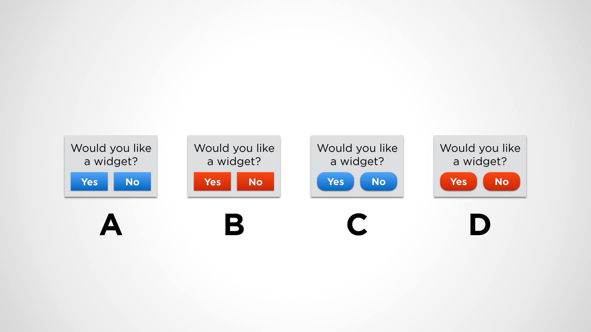
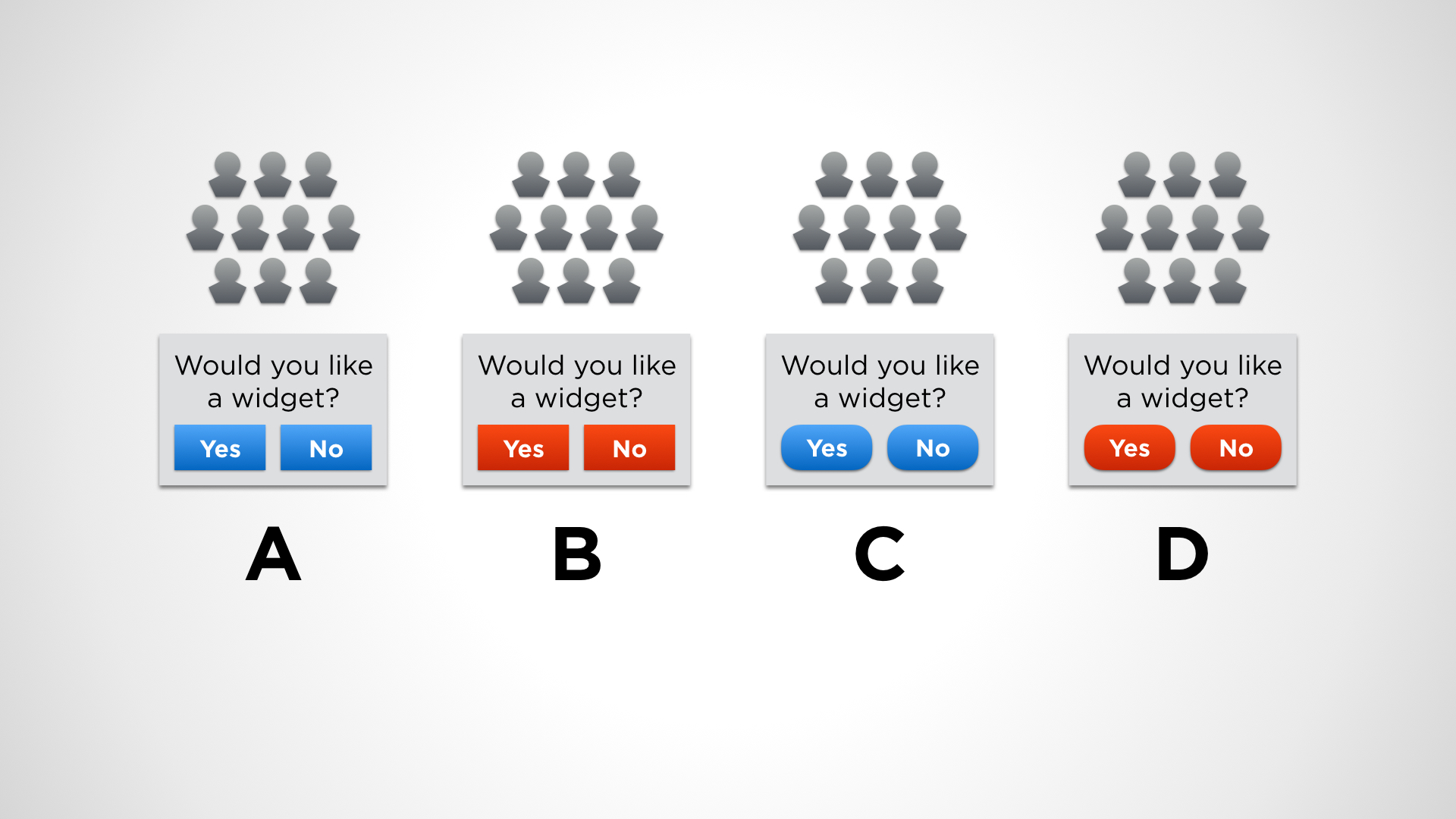
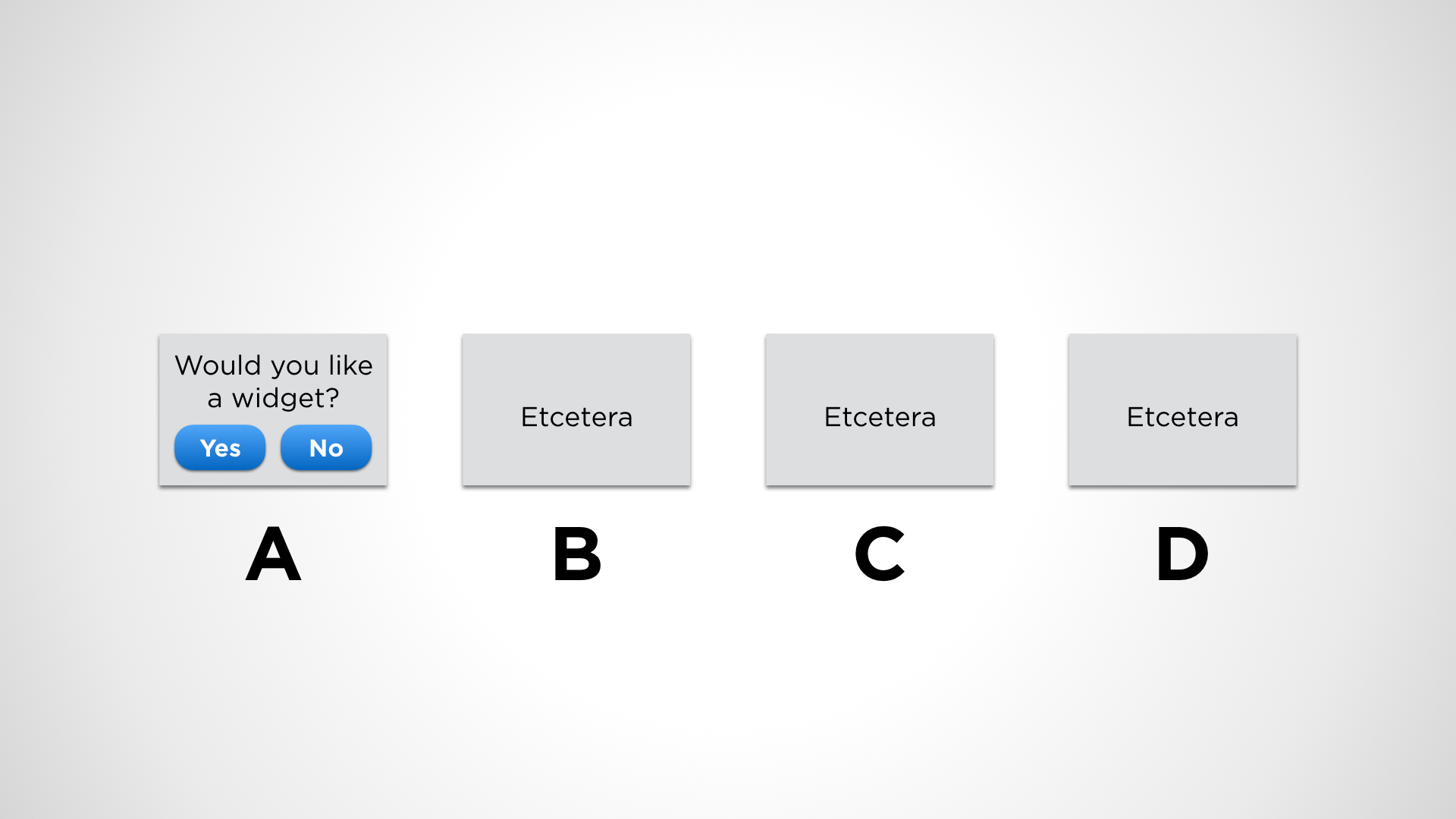
Then you have an idea. Could you sell more widgets if the buttons looked different? It's a good start, but you need to turn your idea into a hypothesis. What's a hypothesis? It is a theory or supposition based on insight, knowledge, evidence, or observation describing a proposed change to a product that will result in an observable and measurable change.
Let's say you have noticed other online stores use red buttons or buttons with rounded corners in their interfaces. Based on these observations, your hypothesis can be, "By using red buttons and/or rounded corners on buttons, my customers would be more inclined to interact with them, resulting in higher widget sales." Remember, this is a hypothesis - you don't know if it's actually true yet, so you want to test it.
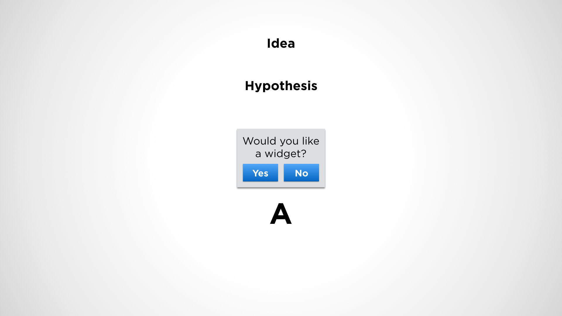
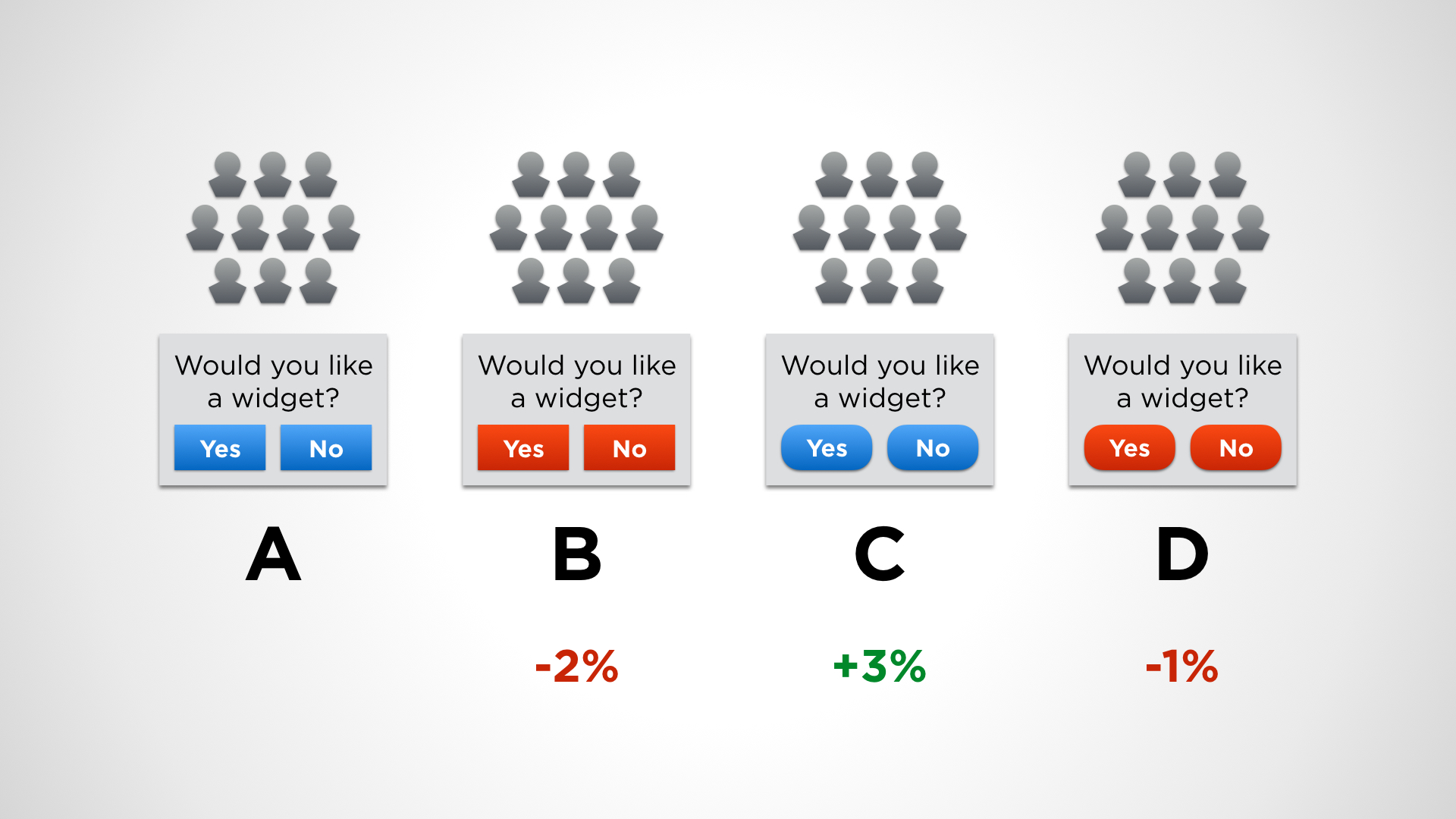
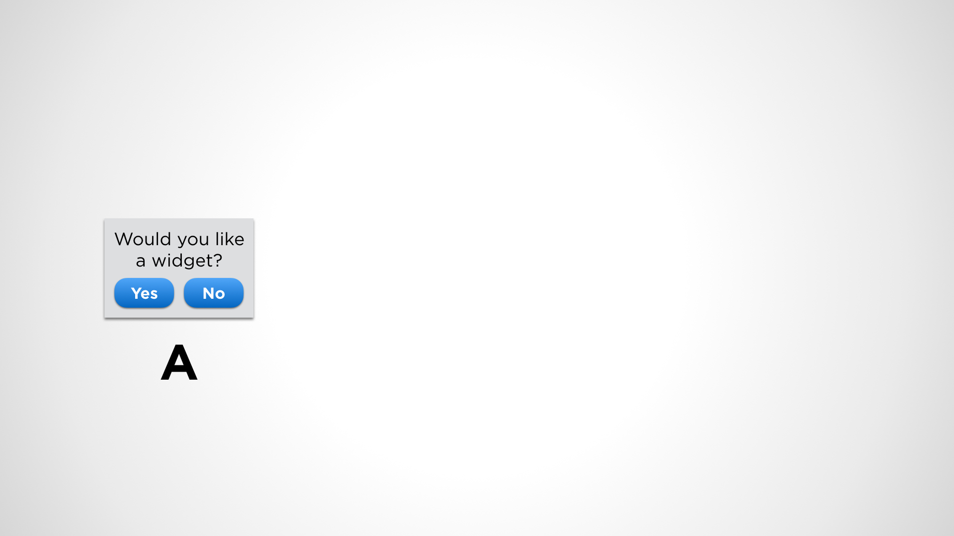
You keep your current design as version A while you design different versions based on your hypothesis. In this example, you create three other versions: B) red buttons, C) blue rounded buttons, and D) red rounded buttons. A is the control version against which all the others are compared to.
Lastly, you deploy your changes to equally-sized cohorts of users in a double-blind, randomized way. This means that each of the four versions have a statistically significant number of equally unbiased users. This is the ideal setup, with data scientists, researchers, and/or statisticians who can help you figure all this out.
The relevant metric in this example is widget sales. Done properly, any differences can be attributed to the changes among the different versions. The more thorough the instrumentation in your software, the better you can track these differences. If in this case you find that version C with the blue rounded buttons increased sales by 3% as compared to control, you can then roll out version C with some confidence that it is an improvement over your previous version. You can continue this process over and over, with the latest, winning version becoming the control version against which new designs are tested.
•••••
This is a very simple example of how A/B testing is done using one variable - the appearance of the buttons. These kinds of small-scale, incremental improvements may help you find the "local maxima" (the highest theoretical point within a range) for a particular design, but this approach can be quite limiting if that's all you end up doing.
Therefore it's necessary to do explore more broadly, up to a complete redesign where you're changing a large number of variables. You can then use the same A/B testing methodology to see if these big differences have a meaningful impact on the metrics you care about as a business.
At Netflix we call this Mountain Testing. It's a form of multivariate testing where we seek to find promising new designs that open up new opportunities for innovation. It enables us to avoid getting stuck in finding the local maxima of an existing design by expanding the range of exploration in order to discover a potentially larger mountain without losing the discipline of testing our assumptions. By staying disciplined on changes both large and small, we only roll out those that we know are better for the customer and the business.
•••••
A/B Testing and Multivariate/Mountain Testing are powerful tools for the modern UX designer. There are many who find them difficult to accept, but as with many tools, they are most effective when used properly. To do that, seek to understand and learn to use them well.
“Good design is good business. ”
For quite a long time, we have learned to measure the effectiveness of business decisions. We see this in the stock market and in the numbers that public companies announce every quarter. And if we believe that "good design is good business", then we must also believe that the impact of good design can be measured in business metrics. Apple has become one of the world's most valuable companies greatly because of their track record in delivering great design.
We as designers have the amazing privilege and responsibility to design products that are meant to have an impact on the businesses we drive and customers we serve, and the more tools we have at our disposal to be more effective, the better.
