Most products have relevant lifespans that are disappointingly fleeting, especially consumer electronics – and those are the successful ones. The unsuccessful ones have commercial lives that are solitary, poor, nasty, brutish, and short, if you were to be philosophical about it.
And so it was with much personal delight that the much-maligned and mostly-forgotten Microsoft Zune was featured in Guardians of the Galaxy Vol. 2.
I have the distinct privilege of being on the original team that created this product that was played up for laughs on the big screen. On behalf of my colleagues, you're welcome.
•••••
Soon after launching the Xbox 360 in late 2005, the same team was tasked with designing and shipping Microsoft's response to Apple's dominant iPod. Additional people were hired and transferred in so that we could build out a new, heretofore non-existent, first-party, media player business while, at the same time, continue the momentum of the Xbox 360. We had around 10 months to get a new product on retail shelves in time for the 2006 holiday shopping season.
Those were heady, optimistic days, and we were all game. Let me share a story about one particular aspect of the Zune - the hardware controls.
•••••
At this point, there were Windows-based portable media players already on the market. Among the most viable was the Toshiba Gigabeat S which came out in early 2006. Not unlike many of its non-iPod contemporaries, it had a lot of buttons spread out on its face and sides:
- Power on/off
- Start menu (Windows)
- Back
- Up
- Down
- Left
- Right
- OK/select
- Previous/rewind
- Next/fast-forward
- Play/pause
- Volume +
- Volume –
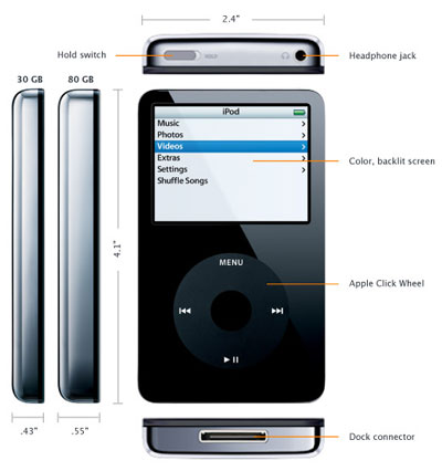
In comparison, the 2005 iPod (5th generation) continued using the game-changing simplicity of the click-wheel. This meant that the market-leading device only had the following controls:
- Scroll down/volume + (clockwise)
- Scroll up/volume – (counter-clockwise)
- Menu
- Previous/rewind
- Next/fast-forward
- Play/pause
- Hold
However, the way it was all integrated made it feel like it really only had one primary control - the legendary click wheel. If you had to be charitable, the d-pad of the Gigabeat could be considered a single control; with this generous interpretation, the Gigabeat had nine controls to the iPod's two. Not good enough.
We knew that the basic software interaction model was going to need much the same thing as the Gigabeat - they were both Windows-based devices at heart - and we didn't have the luxury of time to develop a completely brand new one for the first version. I and another designer tasked with this responsibility sequestered ourselves in a room with a whiteboard to come up with the yet-unnamed device's control scheme.
Some of the recommendations were easy, some less so. The iPod had established some conventions that we could take advantage of, like using Play/pause for Power and Left/Right for Previous/Next. Others we couldn't, since we didn't have an equivalent of a scroll wheel. At the end, our initial recommendation for testing was:
Zune 30
- Power (hold) or Play/pause
- Home (hold) or Back
- Left or Previous/rewind
- Right or Next/fast-forward
- Up or Volume +
- Down or Volume –
- OK/select
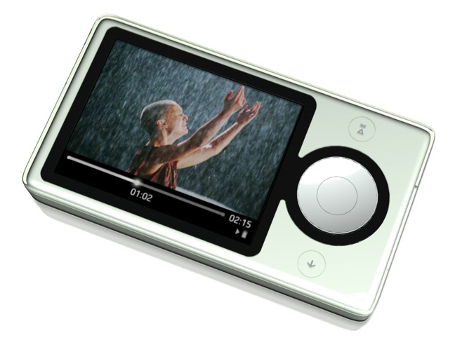
Each of the cardinal directions functioned contextually. When navigating menus, they would work directionally. When interacting with music or video, they would function as volume and media controls. The two standalone buttons did complementary functions based on a long press (hold) or short press; the timing had to be configurable in order to get the behavior right.
We designed the software to work in tandem with this control scheme, and through iterative prototyping and testing, we were able to validate that our proposal met our usability requirements.
The original Zune's complete interface in wireframe form.
This was one of the most fun projects I had worked on, not the least of which was because of the people I had a chance to work with. This is why it was such a kick to see it come to life once again in the movie theater, regardless of the fact that it was meant to be ironically funny. Thanks, James Gunn, that moment made my day.
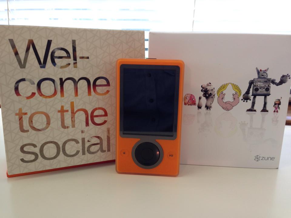
I still have my special-edition orange Zune in its original packaging. I will happily donate it to be used in the Marvel cinematic universe.


